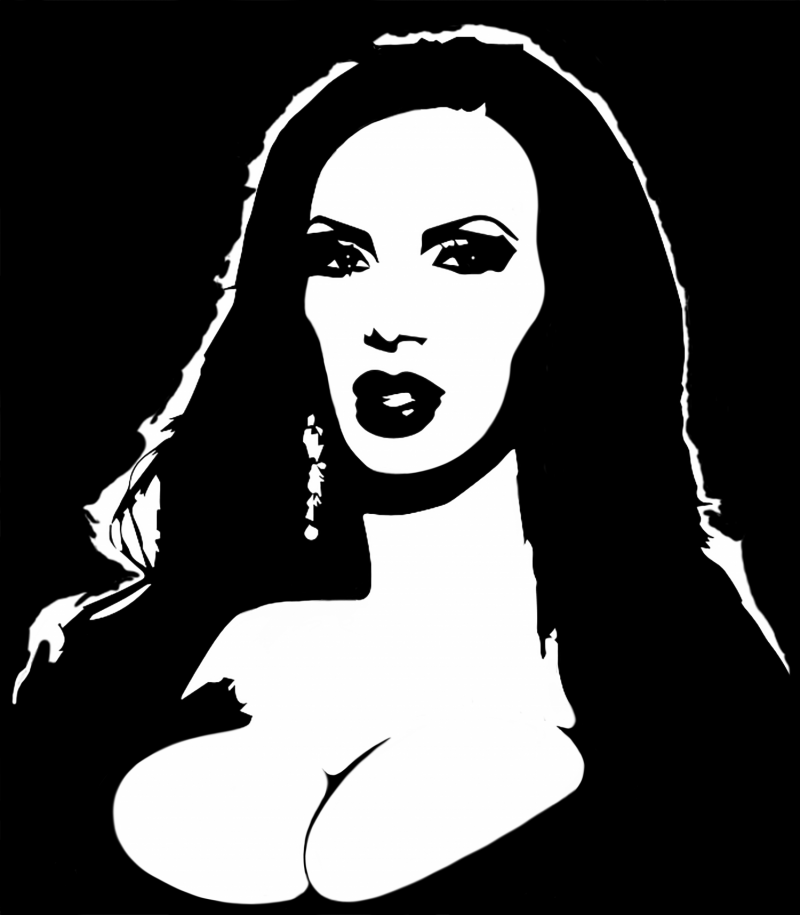
As I’m sure you’ve noticed, I’ve been focusing primarily on the neo-noir style of comics. Again, I’m not a professional, but I’ve been studying comics most of my adult life. Ever since I bought “How to Draw Comics the Marvel Way” in my youth, I’ve been studying and drawing comics. One of my most favorite cartoons ever was Batman the Animated Series and I absolutely fell in love in with the dark noir style of cinematography they used. Recently I discovered a book called “How to Draw Noir Comics” by Shawn Marinbough. I knew then that was the style I wanted to focus on for this website and for the comics I publish. However this particular style is by no means a new thing. Here are some fantastic logos and images that use this same style. Here’s one of my favorites:
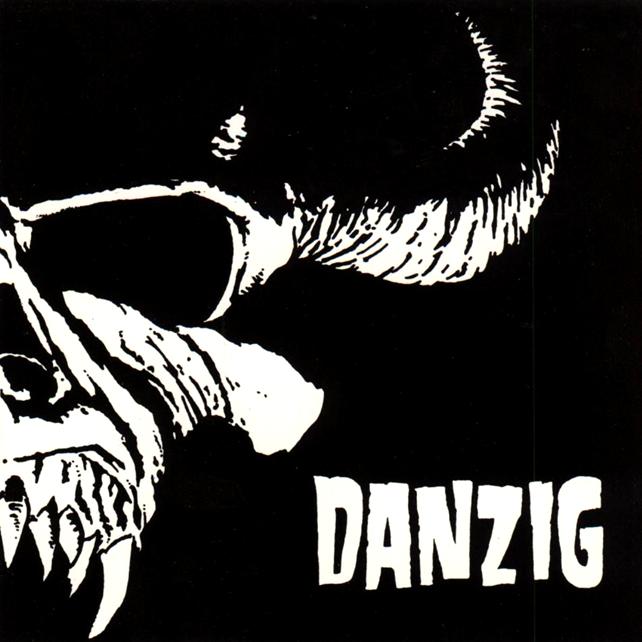
This is the art cover for the debut album of Danzig. The image of the skull devil will become their logo.
Let’s review why this logo is perfect. For starters it looks like a very evil beast, maybe even the devil himself. Danzig has marketed themselves as a cult-like or Satanic band. But here’s kicker, it’s not just the Devil, but the Devil how we imagine him to be: Evil, bold, malicious, powerful, etc. The lighting indicates we are looking at him from the bottom up signifying he’s looking down on us. This is the Devil but souped up! This image is intended to stir up emotions in people. If you’re Christian you’ll have a particular reaction, if you’re a Satanist you’ll have another type of reaction, and if you’re like the rest of us you’ll think this is a cool logo. Personally, I don’t think the band are Satanist in the literal sense, but rather they used the dark imagery to create who they are for their audience. I think that’s the more important part than actually being satanists. Maybe they are satanists!
Here’s another logo, coincidentally by a band that Glen Danzig was also a part of, the Misfits. Here’s their logo:
![]()
It’s a little more simple than the Devil logo but effective non the less! It’s straight and to the point. You look at this and you’re staring at the face of death himself! There’s nothing more needed. The artwork was inspired by a poster for the 1946 film serial The Crimson Ghost.
You don’t see too many neo noir images used today. Most of the masses prefers color. However I think what will work for this line of comics is to keep them in neo-noir, black and white. I will be looking for gritty and dark cinematography. Most of the comics you see here will be horror or dark comedy based. Besides, I am an amateur so coloring these comics would add to the time and cost so it all works out! I’m not promising I’ll never publish comics in horror it’s just not my focus right now.